2018
How I built a 200+ icon deep library for the City of Bend.
Role
Visual Designer
Team Size
1
Platform
Web / Social / Print
Tool Stack
Adobe Illustrator / Figma
Opportunity
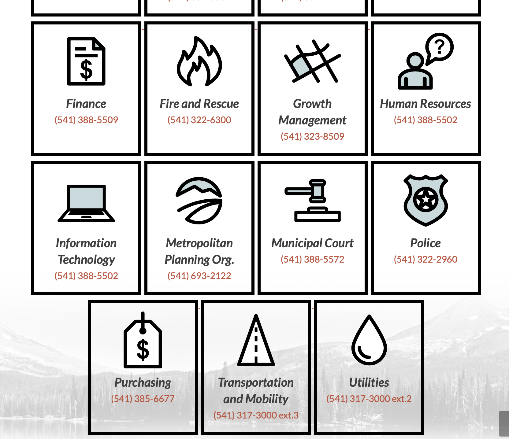
The City wasn’t using icons in its design collateral before I started working with them. Icon usage, of course, has a bunch of benefits:
🌟 Visual Clarity & Speed
Quick recognition: Icons are processed faster by the brain than text, making interfaces feel more intuitive.
Skim-friendly: They help users scan content quickly, especially in navigation menus or dashboards.
🌍 Universal Understanding
Cross-language communication: Icons can bridge language gaps, which is great for global audiences.
Standard meaning: Many icons (like the trash can or magnifying glass) have become universally recognized.
📐 Space-saving
Compact design: Icons take up less space than words, which helps with clean, minimal layouts.
Great for mobile: They’re especially useful on small screens where space is limited.
🎨 Visual Appeal
Enhance aesthetics: Well-designed icons can make a UI feel polished and modern.
Brand personality: Custom icon styles can reinforce brand identity and tone.
🧠 Memory Aid
Reinforce meaning: When paired with labels, icons can make concepts more memorable.
Visual hierarchy: They help structure information and draw attention to key actions or info.
🧭 Improved Navigation
Wayfinding: Icons support easier navigation by visually hinting at what a button or section does.
Consistent cues: Repeated use of the same icons helps users learn how to use an interface faster.
Learnings
The process of distilling down a concept or idea into its simplest visual representation is a puzzle that I love to solve. This exercise actually taught me a lot about how to design—and communicate in general: to do so effectively, it’s important to remove the excess fluff.
Implementation
The icons I designed for the City became a unifying visual thread, ultimately used throughout the website, featured in print materials, and adapted for social content, enhancing consistency and reinforcing the brand across all touchpoints.